

Case Studies / Sara Blakely
Sara Blakely
A digital presence designed to organise product, humour and business authority around a founder who transformed everyday friction into a globally recognisable brand.
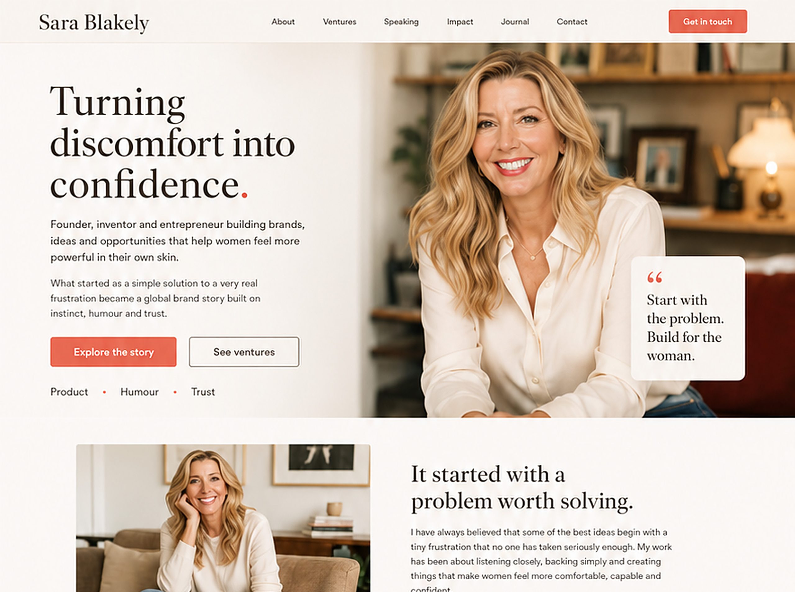
This case study is an unaffiliated conceptual exercise developed by Pibeca Solutions. There is no commercial relationship, collaboration or official assignment from Sara Blakely, Spanx, Sneex or their teams. All brands, names, images and references mentioned belong to their respective owners. Its purpose is to explore opportunities in digital strategy, brand narrative, UX, content structure and web experience based on a public figure and her business ecosystem.
Strategic and conceptual direction: Beatriz Ávila.
This was not about telling another inspiring founder story, but about designing a digital presence capable of turning product, humour and authority into trust.
That was the strategic decision behind the entire exercise.
Why this project exists
Sara Blakely is one of those cases where the origin story is not just a charming anecdote. It is a strategic asset.
Spanx did not begin as a grand corporate abstraction. It began with a very specific discomfort: a garment that did not exist, an everyday need and a solution many women could understand without much explanation.
That is what makes the case interesting. Sara Blakely did not simply create a product. She built a way of talking about the product. Her personal brand works because it connects lived experience, humour, commercial instinct and business authority.
Her value is not only that she identified a need. It is that she framed it in a way that was simple, memorable and commercially powerful. Discomfort became product. Product became category. And category became a platform of trust.
That is where the project begins, with a clear question: how should a digital presence be structured for a founder whose strength lies not only in what she has built, but in how she has made people trust it?
The challenge
The challenge was not to explain who Sara Blakely is. Her visibility already exists.
The challenge was to organise a brand ecosystem with many layers:
- •Product
- •Origin story
- •Personal brand
- •Humour
- •Business authority
- •Impact
- •New initiatives
- •Trust
A conceptual website for Sara Blakely would need to avoid two predictable routes: becoming an inspirational biography or turning into a soulless corporate page.
The opportunity was elsewhere: to build a digital platform capable of connecting experience, product and authority without losing warmth.
Not more inspiration. Better structure.
Brand interpretation
Our brand interpretaion is that the Sara Blakely brand works because it holds a very specific tension
- •Approachable, but not amateur.
- •Playful, but not lightweight.
- •Feminine, but not decorative.
- •Commercial, but not cold.
- •Vulnerable, but powerful.
That tension is what gives the brand strategic value. Many brands lose their freshness as they grow. Others try to sound human from a structure that feels too rigid.
With Sara Blakely, something different happens: closeness does not weaken authority. It reinforces it.
Her humour is not decoration. It is a trust mechanism. It allows the brand to talk about discomfort, bodies, failure, money, ambition and product without becoming stiff or artificial.
We did not want a product website, a speaker website or a founder page reduced to a timeline of milestones. We wanted a platform that could make the full architecture of her brand visible: what she saw, what she built, how she communicated it and why it generated trust.
The strategic decision
The proposal starts from one central idea: Sara Blakely did not just turn discomfort into product. She turned a concrete experience into a way of creating trust.
That is why the website should not be built as a biographical page, but as an editorial and strategic platform.
The goal would be to organise her universe around four core ideas:
Product
A simple solution born from a real need.
Humour
A way of communicating without stiffness, performance or corporate distance.
Trust
The ability to make the product, the story and the founder reinforce one another.
Authority
The business validation of an instinct that eventually became a category.
Methodology, assumptions and limits
This case study is based exclusively on publicly accessible information: Sara Blakely’s public trajectory, the brands associated with her business ecosystem, visible digital presence, public communication, available content, interviews, impact initiatives and open references to her activity as a founder and investor.
The proposal does not include access to internal analytics, commercial goals, conversion data, private brand strategy, business priorities, contractual restrictions, content rights, editorial calendars, approval processes or needs expressed directly by Sara Blakely, Spanx, Sneex or their teams.
It should therefore be read as a conceptual hypothesis, not as an internal audit or an official recommendation. This reading does not imply a lack of strategy or judgement in the current presence either: any brand ecosystem can be shaped by internal decisions, commercial priorities, rights, teams, growth stages or needs that are not visible from the outside.
The purpose of this exercise is to explore how product, founder brand, authority, humour, impact and new initiatives could be better connected through digital strategy, brand narrative, UX, content structure and visual design.
How success would be measured
Because this is a conceptual exercise, any performance indicator would need to be validated against real data, internal analytics and goals defined by the team responsible for the platform. Even so, a digital presence of this kind could be evaluated through signals such as navigation clarity, ecosystem comprehension, ease of distinguishing between brands, initiatives, editorial content, speaking, impact and professional opportunities.
It would also be relevant to measure engagement with the origin story, navigation between products and initiatives, the quality of enquiries generated through the website, behaviour on speaking or press pages, newsletter conversion, use of editorial content and the platform’s ability to explain Sara Blakely’s value beyond one single brand.
Success would not depend only on attracting more visits. It would depend on organising the relationship between experience, product, authority, personality and trust more effectively.
THE CONCEPTUAL DIRECTION
01 · Visual direction
The visual direction needed to move away from both conventional corporate aesthetics and the obvious “girlboss” imaginary.
The visual world would require a mix of warmth, product and authority. A website built with ivory, nude, blush, cocoa and coral tones, able to connect with the body, comfort and trust without feeling sweet, clichéd or overly commercial.
Founder image
Sara as a central presence, but not as a distant celebrity.
Textures and product
Fabric, movement, body and detail suggesting usefulness without turning the page into a catalogue.
Editorial quality
Large headlines, generous whitespace, clean composition and the feeling of a brand with judgement.
Premium warmth
A feminine website without becoming decorative. Approachable without losing presence.
02 · The homepage concept
The homepage should open with a strong idea, not a functional description.
It is not about saying “founder of Spanx”.
It is about positioning the pattern that runs through her brand:
turning discomfort into confidence.
From there, the page could unfold as a progressive experience.
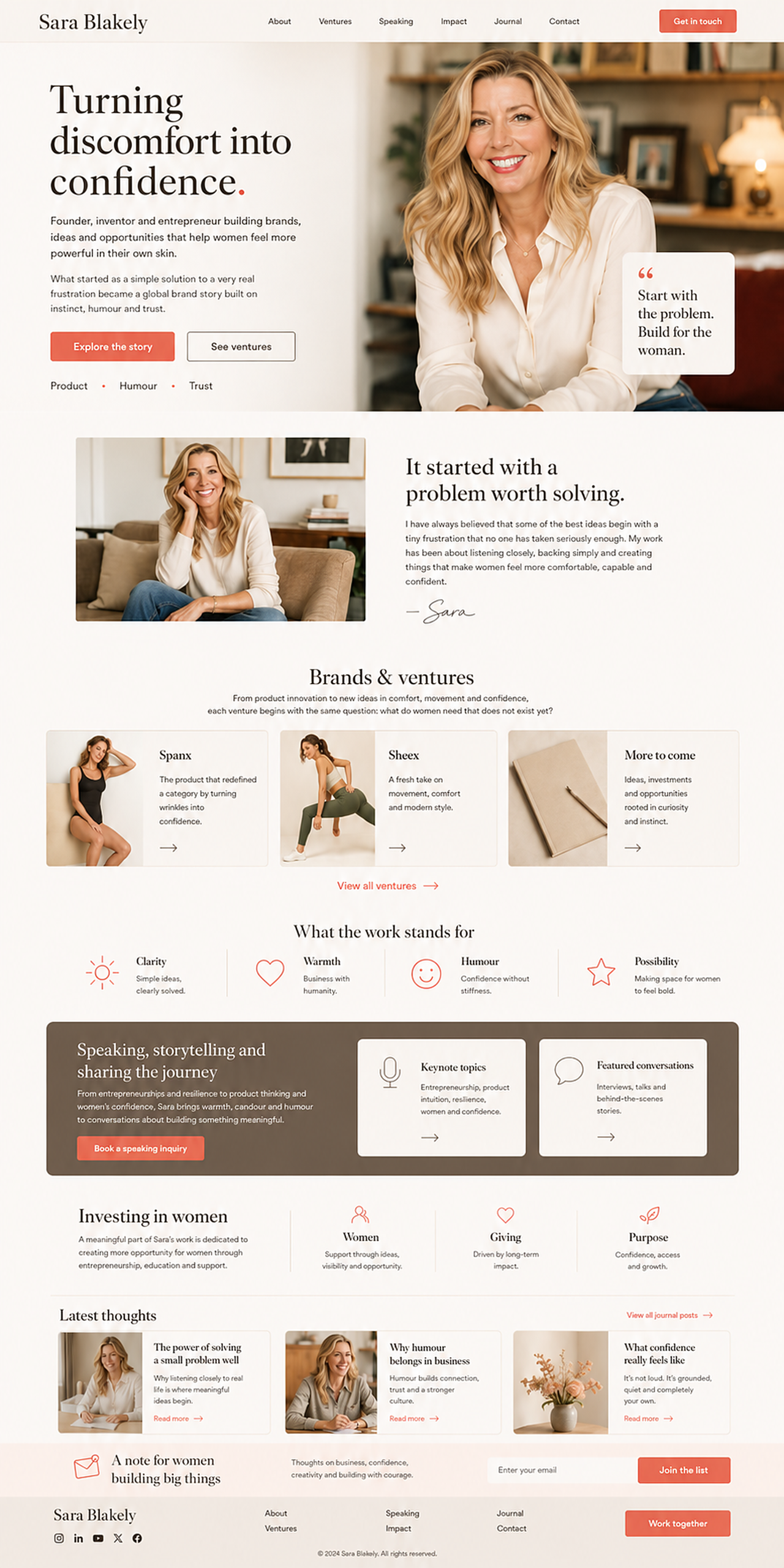
First, the hero establishes the big idea: Sara Blakely as a founder able to turn a specific discomfort into confidence, product and opportunity.
Then, the origin story provides context without turning the page into a linear biography.
The brands and initiatives section organises the business ecosystem: Spanx, Sneex, investment, future ideas and possible content verticals.
The values block explains what holds the work together: clarity, warmth, humour and possibility.
The speaking and storytelling area turns her public voice into a structured asset, not a secondary section.
The impact section introduces the dimension of women, opportunity and entrepreneurship without turning it into reputational decoration.
The journal or editorial area keeps the website alive and reinforces thought, judgement and relevance.
Finally, newsletter, contact and footer make the digital presence useful for different audiences: community, press, brands, partners, events and future initiatives.
The homepage should not feel like a product page or a motivational page. It should feel like a founder-led digital presence: clear, warm, strategic and voiced.
03 · Narrative system
One of the most important aspects of the case is that the website would need to organise the story without turning it into a flat chronology.
The narrative should follow a recognisable sequence:
Problem
An everyday discomfort many women understood.
Solution
A simple, specific and useful product.
Voice
A founder able to explain the problem with humour and clarity.
Scale
A brand able to turn one concrete product into a recognisable category.
Trust
A direct relationship between lived experience, usefulness and credibility.
Evolution
The ability to keep creating, investing and building new opportunities without losing the original essence.
04 · From iconic product to founder brand
One of the most important decisions was to change the mental frame.
A digital presence for Sara Blakely should not be limited to a page about Spanx, a success biography or a showcase for speaking engagements.
It should act as a founder brand platform.
That means each section should serve a different audience:
Community
Needs closeness, inspiration, useful content, thought and a clear way to follow her work.
Press
Needs context, biography, milestones, reliable materials and a clear reading of her trajectory.
Brands and partners
Need to understand positioning, values, compatibility, collaboration opportunities and authority.
Events and conferences
Need topics, approach, tone, public experience and clear contact routes.
Entrepreneurs and women leaders
Need a doorway into ideas, impact, resources, learning and opportunity.
The goal would not be to absorb every brand, product or initiative into one rigid website. The main hub would work as a layer of orientation, context and connection: an entry point able to organise product, story, impact, ideas, speaking and new initiatives, while respecting the specialised spaces that already serve their own purpose.
From this perspective, the website would not replace Spanx, Sneex, foundations, social platforms, interviews or commercial channels. It would connect them more clearly, helping each audience find the right path without fragmenting the overall perception.
05 · Voice, trust and editorial operation
A founder brand is not sustained by a strong homepage alone. It needs a recognisable voice and an editorial operation capable of maintaining coherence over time.
In Sara Blakely’s case, the voice should preserve one of her greatest strengths: the ability to talk about real things without losing intelligence. Direct, because the problem does not need to be dressed up. Human, because trust comes from lived experience. Sharp, because humour can open conversations that many brands treat with too much rigidity.
The website would need clear editorial criteria for story, brands, speaking, impact, investment, newsletter, interviews and current content. It would also require a coherent way to decide what gets published, which initiatives are connected, how new projects are presented and how the platform stays alive without becoming a disordered archive.
This operational layer is key to preventing the website from becoming, over time, a collection of inspirational blocks. The goal would not simply be to launch a new digital presence, but to sustain a recognisable, useful platform aligned with a founder who combines product, humour, commercial instinct and business authority.
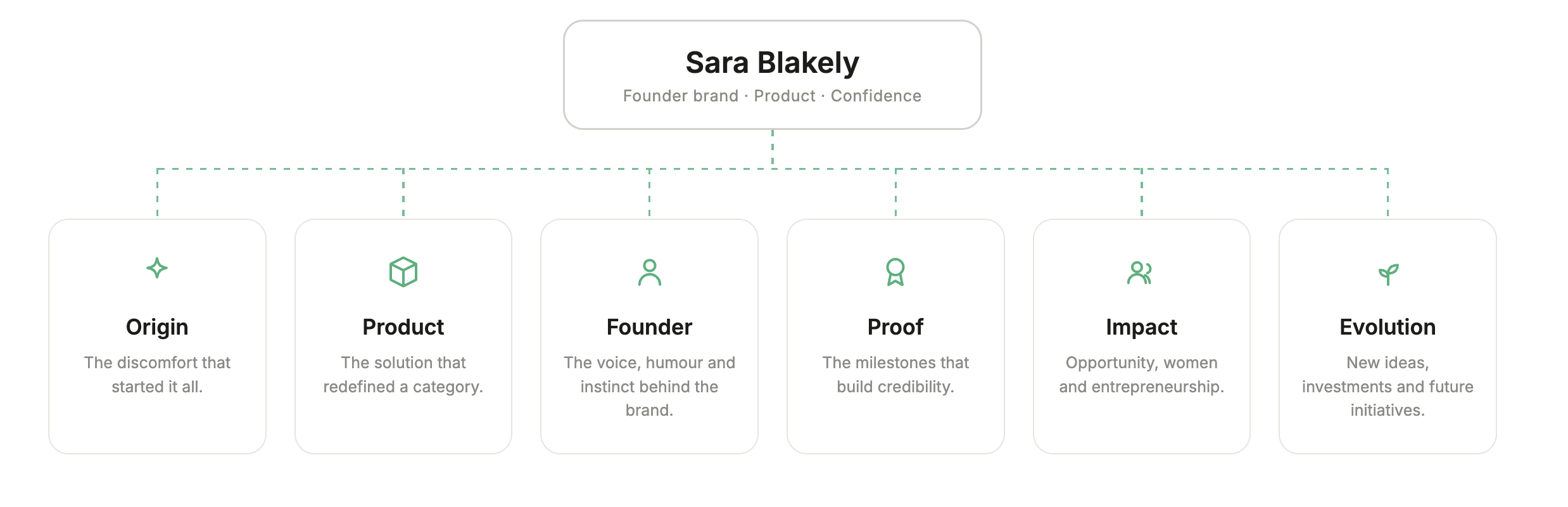
Ecosystem architecture
A central hub that organises content and brands, connected to specialised verticals.
What changes with this proposal?
- •
A well-known success story, but one dispersed across product, interviews, business milestones and initiativesSara Blakely has a highly recognisable story, but a founder-led digital presence would need to organise the relationship between product, story, authority, impact and future initiatives more clearly.
- •
A powerful personal brand, but one that can easily be reduced to inspirationHer trajectory is inspiring, but if the reading stops at motivation, the strategic logic that turned everyday discomfort into a category becomes less visible.
- •
A founder strongly associated with an iconic productSpanx is a fundamental part of the story, but it does not exhaust the reading of Sara Blakely as an entrepreneur, communicator, investor and public figure with her own point of view.
- •
Humour and closeness as visible traits, but not necessarily structured assetsTone is one of her strongest assets. The opportunity would be to make it part of the trust system, not just a personality trait.
- •
Impact and initiatives connected unevenlyFoundation work, investment, speaking, editorial content and new projects could work better if organised through a shared architecture.
- •
A digital platform capable of communicating product, story, authority and trustThe proposal turns the website into an editorial and strategic experience able to explain what Sara Blakely represents beyond one single brand.
- •
The user understands the ecosystemThe homepage works as a map: origin, brands, thought, speaking, impact, investments, content and contact routes are organised into clear paths.
- •
The founder brand becomes a trust engineThe personal brand is not presented only as reputation or biography, but as a way to connect experience, usefulness, humour and authority.
- •
The product is read as the beginning of a logic, not the end of the storySpanx works as the origin of a way of seeing problems, identifying opportunities and building solutions.
- •
Impact gains narrative contextThe dimension linked to women, opportunity and entrepreneurship is integrated as part of the ecosystem, rather than reduced to a decorative section.
- •
The website can grow without losing the originNew initiatives, investments, collaborations or content can be added without fragmenting the perception of the brand.
Key decisions
Pibeca's contribution
Does your brand need to turn experience into trust?
We design brands, websites and digital ecosystems that connect product, story and authority, so your brand can be understood, believed and remembered without losing its personality.