

Casos de estudio / IKEA Business
IKEA Business
A conceptual redesign of a B2B digital experience that keeps IKEA’s recognisable DNA, while reorganising products, services, sectors and expert support into a clearer platform built around professional projects.
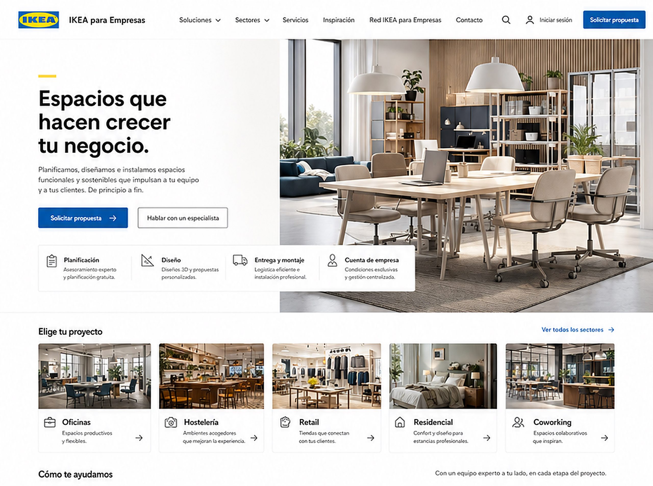
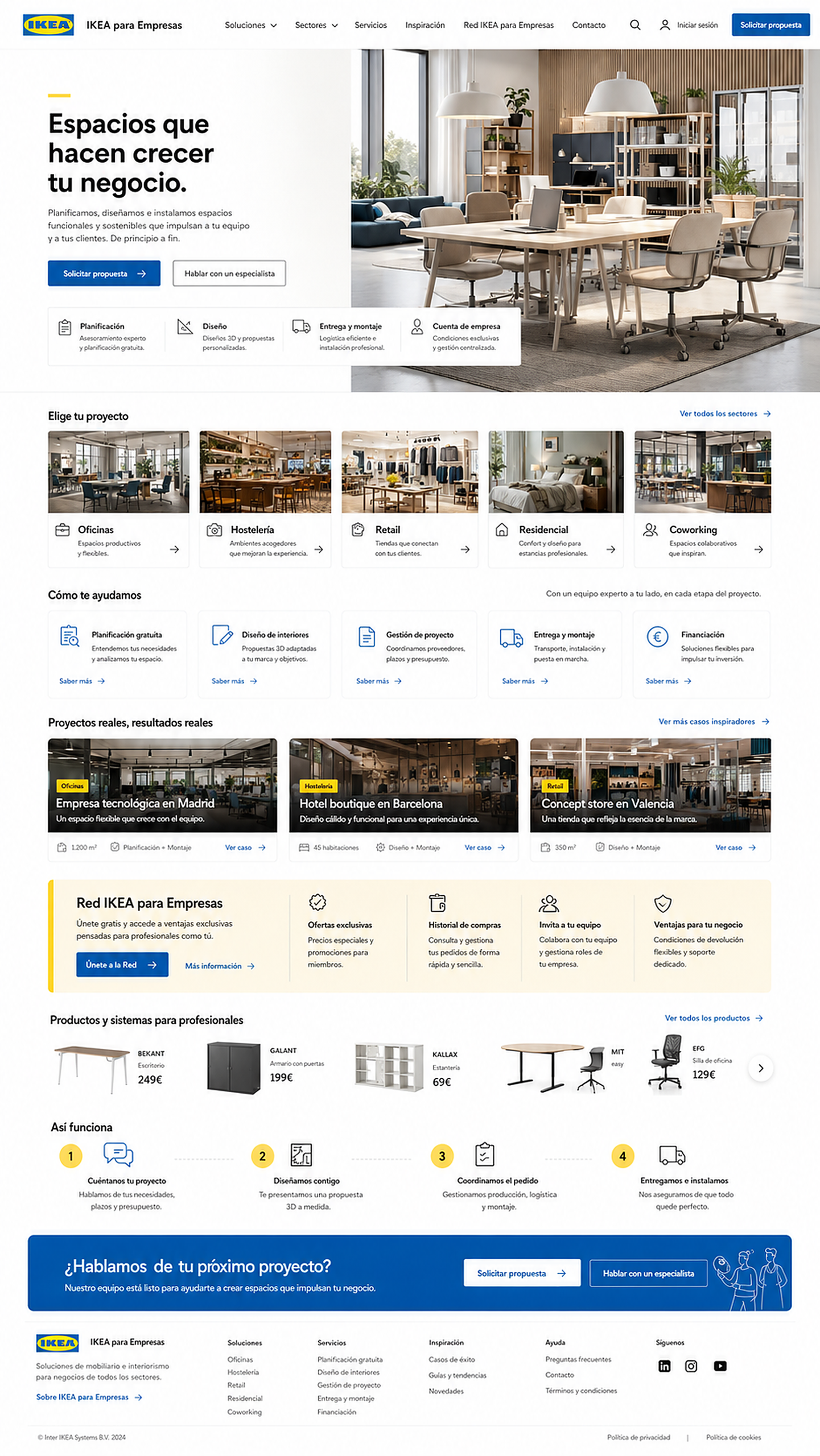
This case study is an independent conceptual exercise and is not affiliated with, commissioned by or validated by IKEA. There is no commercial relationship, collaboration or official assignment from IKEA or its teams. The objective is to explore opportunities in digital strategy, B2B experience, service architecture and web design using publicly available information about IKEA Business as a starting point.
Strategic and conceptual direction: Beatriz Ávila.
The goal was not to separate IKEA Business from IKEA, but to give it a professional layer of its own: clearer, more project-oriented and more useful for people making business decisions.
Why this project exists
IKEA Business already starts from a powerful position: a globally recognised brand, a broad product range, dedicated services and a proposition designed for companies that need to furnish or transform professional spaces.
The opportunity is not a lack of offer. It is the way that offer is structured.
When a company arrives on a B2B page, it does not behave exactly like a private consumer. It is not only looking for inspiration. It is trying to answer more operational questions:
Which solution fits my type of business?
Who supports me through the process?
Can I request a proposal?
Is there planning, design, logistics and installation?
Can I manage purchases as a company?
Can I repeat orders, invite my team or centralise invoices?
The conceptual opportunity was to reorganise the experience so that a professional visitor could understand the full value of IKEA Business faster.
The challenge
The main challenge was to balance two forces.
On one hand, IKEA has a very strong visual identity. Moving too far away from it would be a mistake, because the brand already communicates trust, familiarity, accessibility and scale.
On the other hand, a B2B experience cannot feel exactly like a general ecommerce experience. A professional user needs more structure, a clearer process, stronger sector-based guidance and a greater sense of support.
The challenge, then, was to design an experience that still felt unmistakably IKEA, but could be read as a professional solutions platform for businesses.
Not a store with a B2B label.
Not a promotional landing page.
Not an inspiration gallery without a decision architecture.
A homepage that helps users understand, choose, trust and move forward.
Brand interpretation
The strategic reading was that IKEA Business does not need to reinvent the brand. It needs to change the angle from which the offer is presented.
The current experience already contains many valuable elements: inspiration by space, services, the IKEA Business Network, planning, advice, delivery, assembly, products and business benefits.
But these elements become stronger when they are reorganised through a more professional narrative.
Not: “we have products for your business ”, but: “we help you create, equip and launch a space that works for your business.”
That shift may seem small, but it changes the whole experience.
The homepage stops revolving around the catalogue and starts revolving around the project. The product is still there, but it no longer leads the conversation. The space, the service, the process and the outcome do.
The strategic decision
- •A more direct and strategic hero section.
- •Navigation built around solutions, sectors and services.
- •A primary call to action focused on requesting a proposal.
- •An initial trust block with planning, design, delivery, assembly and business account benefits.
- •A clear entry point by project type.
- •A stronger service architecture.
- •Inspirational cases that feel closer to business proof.
- •An IKEA Business Network section presented as an operational advantage.
- •A simple four-step process.
- •A final section designed to start a commercial conversation.
Methodology, assumptions and limits
This case study is based exclusively on publicly available information about IKEA Business and IKEA para Empresas: their current content structure, communicated services, IKEA Business Network benefits, inspiration categories, visible products and existing journeys for professional users.
The proposal does not include access to internal analytics, commercial targets, customer segmentation, business priorities, operational constraints, margins, conversion data, internal processes, supplier agreements, logistics structure, local market conditions or needs directly expressed by IKEA or its teams.
It should therefore be read as a conceptual hypothesis, not as an internal audit or an official recommendation. This reading does not assume a lack of strategy in the current experience either. A public-facing page can be shaped by commercial, technical, legal, operational or market decisions that are not visible from the outside.
The purpose of the exercise is to explore how a broad B2B offer — products, services, sectors, benefits, logistics, financing, inspiration and business account features — could be organised more clearly through digital strategy, information architecture, user experience, commercial narrative and web design.
How success would be measured
Because this is a conceptual exercise, any metric would need to be validated against real data, internal analytics and goals defined by the responsible team. Still, a B2B experience of this kind could be evaluated through signals such as navigation clarity, use of sector-based entry points, interaction with key services, clicks on “Request a proposal”, contact with specialists and IKEA Business Network sign-ups.
It would also be useful to measure lead quality, recurrence among business account users, repeat orders, use of purchase history, team invitations, conversion from inspiration content into services, and friction reduction between exploration, proposal, purchase, delivery and installation.
Success would not depend only on attracting more traffic. It would depend on creating a clearer relationship between inspiration, services, products, professional decision-making and B2B conversion.
THE CONCEPTUAL DIRECTION
01 · A hero that feels less ecommerce and more project-led
- •A strategic message.
- •A professional space image.
- •Primary CTA: “Request a proposal”.
- •Secondary CTA: “Talk to a specialist”.
- •A trust block with planning, design, delivery, assembly and business account features.
02 · Sectors that accelerate identification
The homepage proposes a clear entry point by project type: offices, hospitality, retail, residential projects, coworking.
This structure helps each visitor find their context faster. Furnishing a flexible office is not the same as renovating hotel rooms, designing a shop or equipping a coworking space.
The goal is to reduce the feeling of “IKEA has many things” and replace it with a more useful reading: “IKEA understands my type of space”.
03 · Services as value architecture
One of the strongest assets of IKEA Business is its service layer: planning, design, delivery, assembly, project management and expert guidance.
In the proposal, these services move up in the hierarchy.
They do not appear as secondary links, but as a clear architecture of support: free planning, interior design, project management, delivery and assembly, financing.
This changes the user’s perception. IKEA stops feeling only like a furniture supplier and starts feeling like an operational partner that can help solve spaces from beginning to end.
04 · Inspiration turned into evidence
-
- •A tech company in Madrid.
- •A boutique hotel in Barcelona.
- •A concept store in Valencia.
05 · La IKEA Business Network as a tool, not just a club
The IKEA Business Network already exists as a benefits programme for companies, with advantages such as exclusive offers, purchase history, team access and business account features.
In this proposal, the Network is not presented only as a promotion or discount club, but as a management tool for businesses.
The message shifts from: “join and get benefits” to “centralise purchases, manage your team, access business conditions and work more efficiently.”
This makes the IKEA Business Network feel more useful for purchasing managers, administrators, operations teams and business owners.
06 · Product present, but not dominant
The product remains essential. IKEA is IKEA.
But in this proposal, product does not dominate the page from the beginning. It appears after the context has been established: sectors, services, projects and business benefits.
The “Products and systems for professionals” section works as support, not as the main axis of the experience.
This keeps the commercial purpose intact without reducing the B2B experience to a catalogue.
07 · A clearer process to reduce friction
Many companies do not move forward if they do not understand what happens next.
That is why the proposal includes a simple process: tell us about your project, we design with you, we coordinate the order, we deliver and install.
For a professional user, this kind of clarity matters. They need to know who will support them, what steps are involved and what they can expect after clicking.
A clearer process reduces uncertainty and makes the next action feel easier.
08 · A professional layer without breaking the parent brand
One of the most important decisions was not to make IKEA Business feel visually detached from IKEA.
Professional users also recognise and value the clarity, accessibility and familiarity of the brand. That is why the proposal keeps essential codes: white space, blue, yellow, bright photography, simple language, modularity, functionality and a practical design attitude.
The difference is not about making IKEA look like something else. It is about reorganising the experience through a different logic.
In B2C, a user may arrive to discover, compare, get inspired or buy a specific product. In B2B, the user often arrives with a responsibility: solve a space, justify a decision, coordinate a budget, involve a team and make sure delivery, assembly and operations work.
The professional layer needed to respond to that way of deciding without losing IKEA’s democratic and recognisable character.
09 · Governance and operation for a B2B experience
A B2B platform does not end with the homepage design. To work as a useful system, it needs an operation capable of sustaining content, services, sectors, campaigns, products and account benefits coherently over time.
For an experience like IKEA Business, it would be important to define clear criteria for updating services, highlighting sectors, publishing project examples, prioritising professional products, communicating Network benefits and coordinating messages across inspiration, sales, logistics and support.
The relationship between global content and local adaptation would also need care. The needs of an office, hotel or retail space may repeat across markets, but delivery conditions, financing, assembly, availability and customer support can vary.
This operational layer is what prevents the experience from gradually becoming a collection of links, campaigns and products again. The objective would not only be to launch a clearer homepage, but to sustain a professional platform that can evolve with the offer, the sectors and the real needs of business customers.
Ecosystem architecture
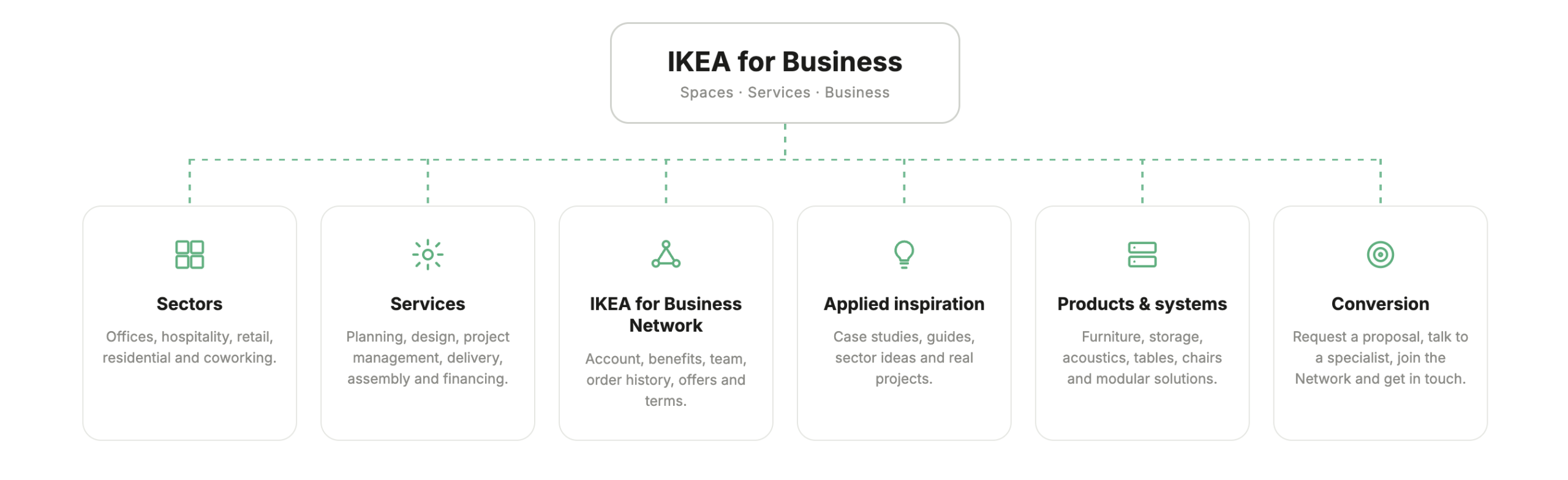
A central hub that organises sectors, services, content, products and business benefits around one main idea: helping professional users move from need to project.
What changes with this proposal?
- •An experience closely tied to the general IKEA ecosystem.
- •A strong emphasis on inspiration, products and links.
- •Services are present, but not always positioned as the core value proposition.
- •The IKEA Business Network is mainly perceived as a benefits club.
- •Professional users have to interpret the journey themselves.
- •Product appears as the starting point, even when many companies arrive with a project-based need.
- •Conversion depends on the user finding the right path between content, services and contact points.
After
- •A homepage built around professional projects.
- •A clearer separation between the B2C and B2B experience, without breaking IKEA’s DNA.
- •Services become the main value architecture.
- •Sectors help users identify themselves faster.
- •Application examples provide professional context.
- •The IKEA Business Network is presented as an operational tool.
- •Product is integrated as part of the solution, not as the only axis of the experience.
- •A clearer process connects the initial need with proposal, coordination, delivery and installation.
- •Conversion is more clearly oriented towards B2B opportunities: requesting a proposal, talking to a specialist or activating a professional account.